Case Studies

Branding, Packaging Design, Art Direction, Character Illustration
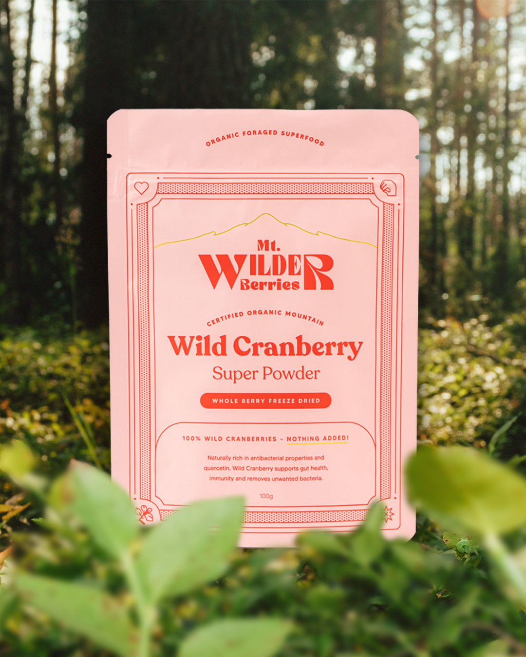
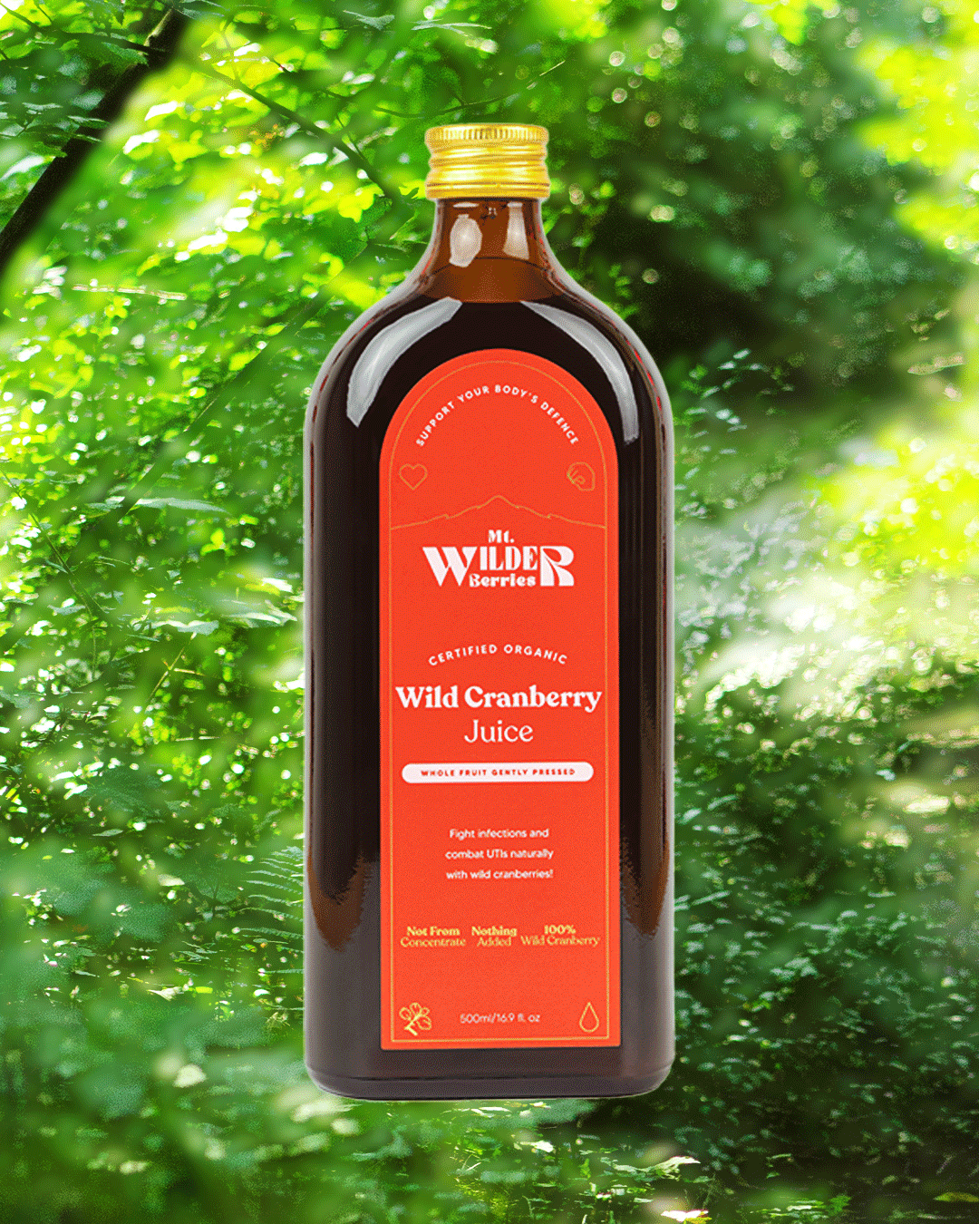
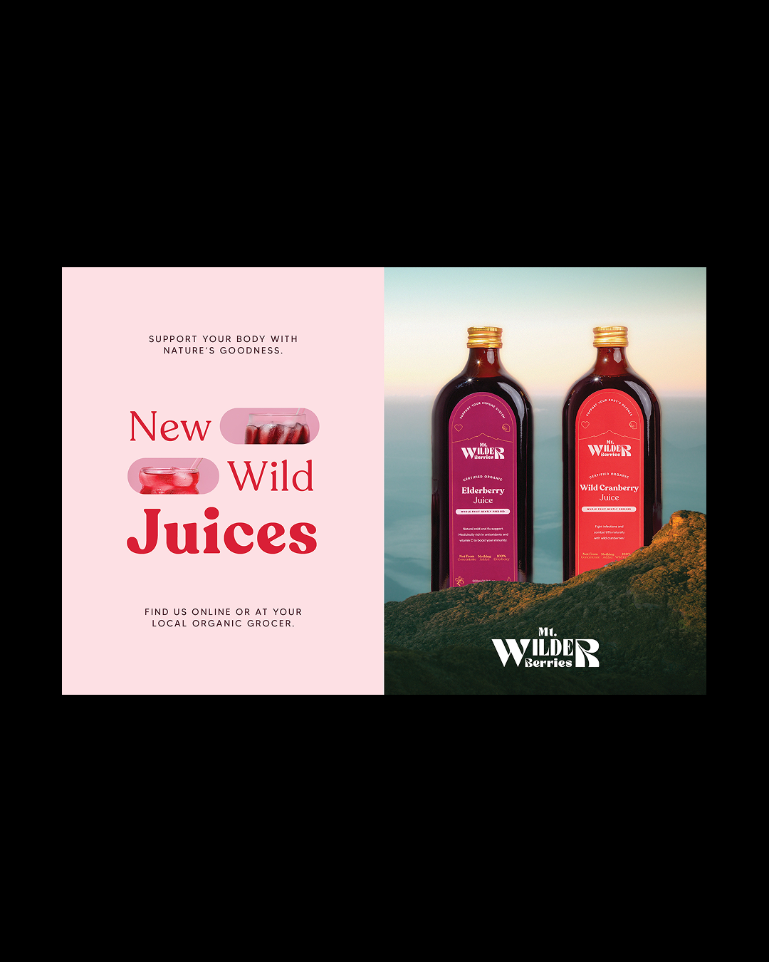
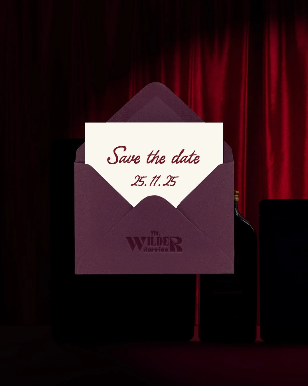
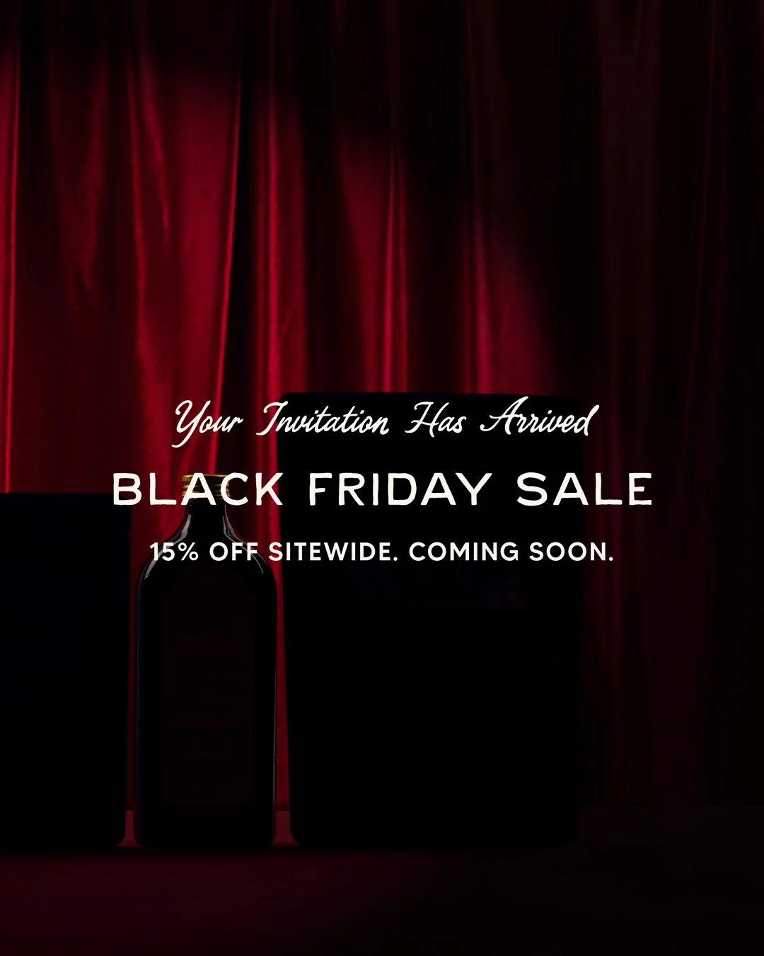
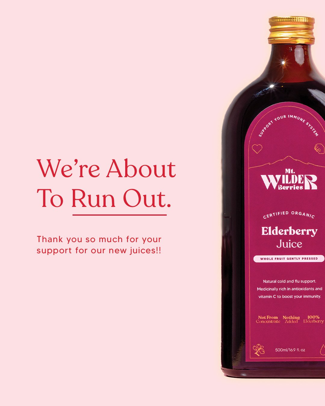
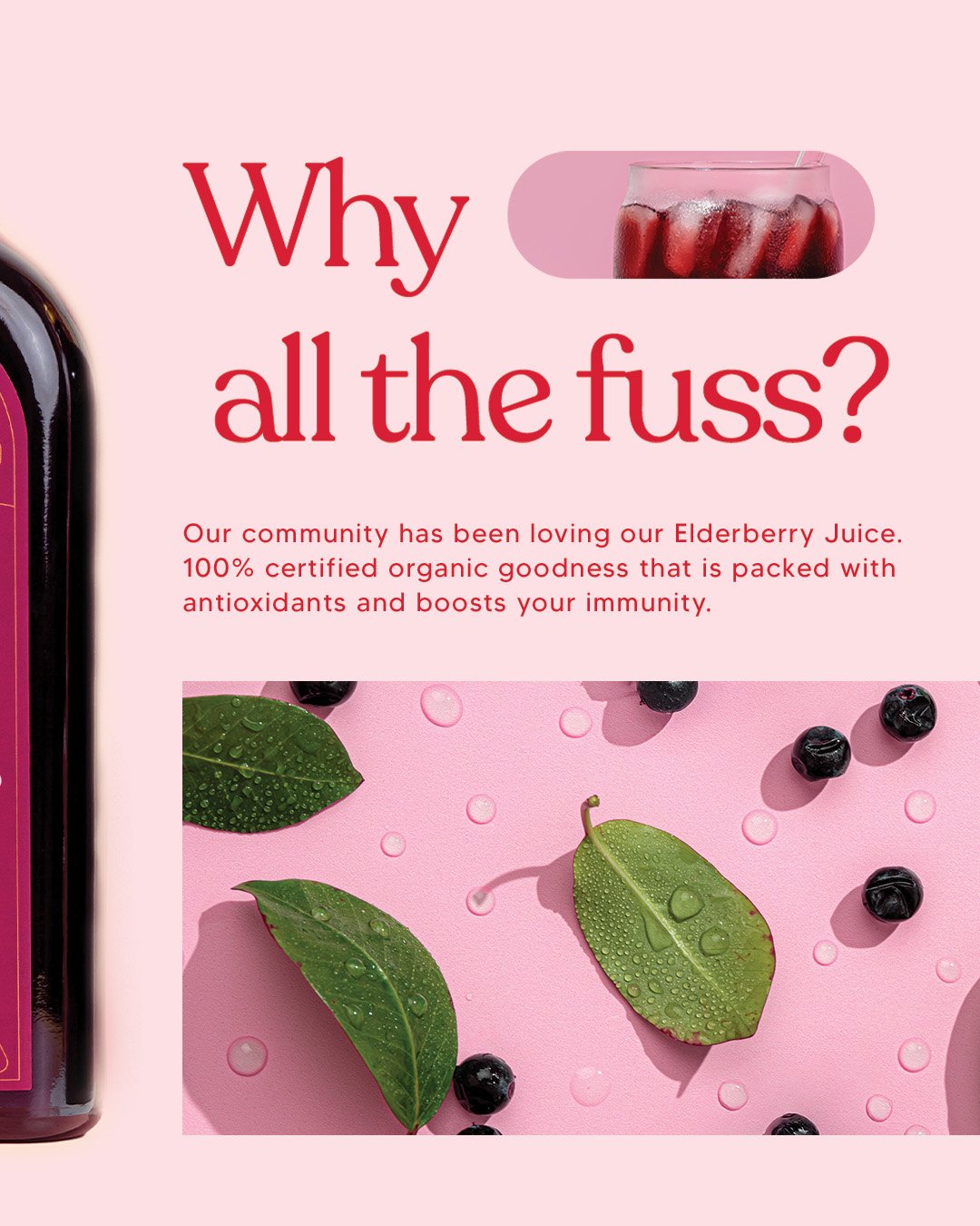
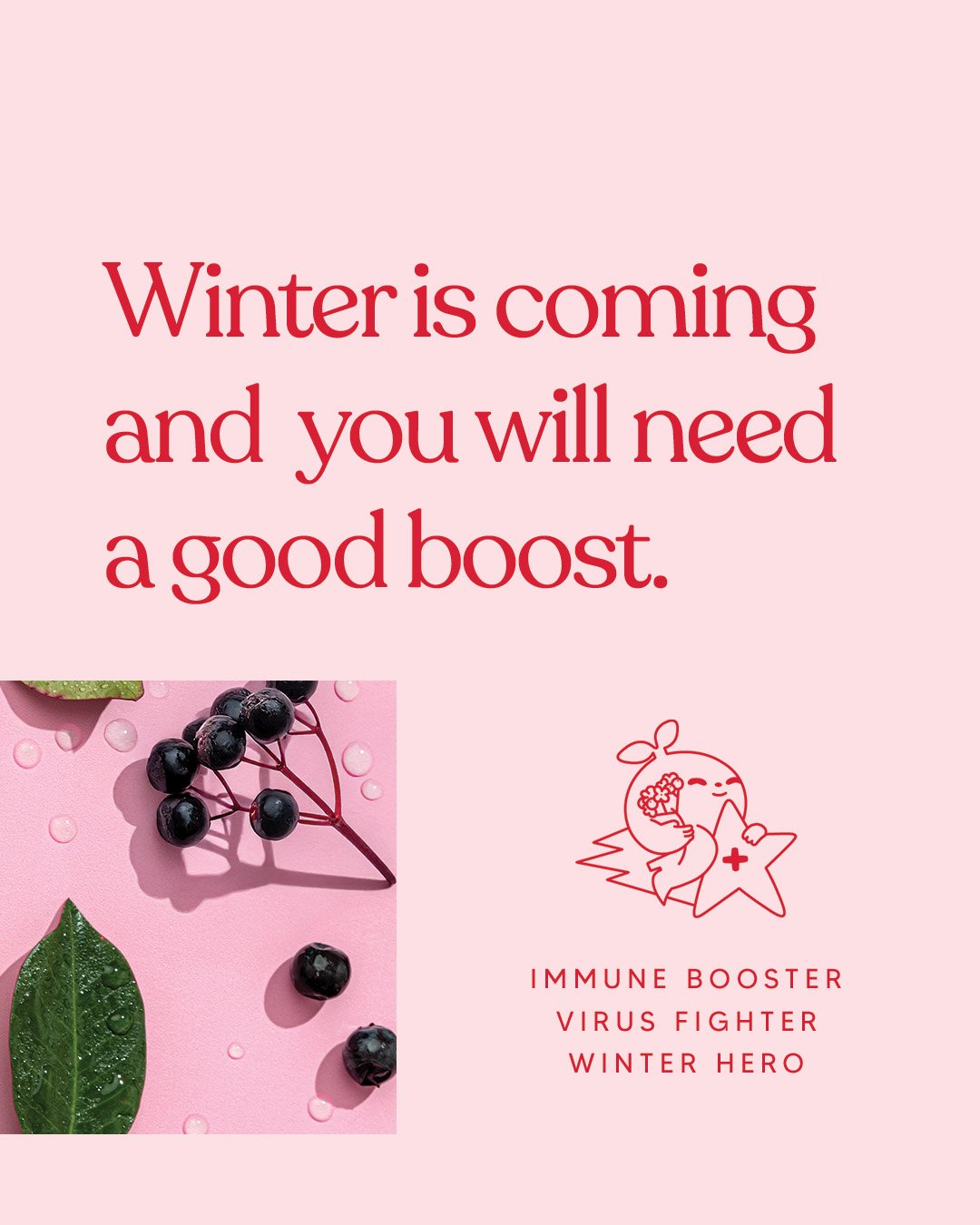
Mt. Wilder Berries
Industry: Food & Beverage
Location: Brisbane, QLD, Australia
Website: mtwilderberries.com.au
Mt. Wilder Berries offers wild-harvested, nutrient-dense berry products designed to reconnect people with the healing power of nature. With a product range spanning frozen berries, powders, juices, and accessories, their mission is rooted in purity, wellness, and sustainability.
-
Client goal:
To evolve their brand identity and packaging system into something more cohesive, characterful, and reflective of their values—while maintaining clarity and consumer trust across SKUs.Initial challenges:
Their early brand and packaging lacked punch, cohesion, and shelf appeal. They wanted to move into more vibrant, premium territory without losing authenticity.Business need:
Create a design system that could scale across multiple products, clarify brand voice, and invite customers into the Mt. Wilder world. -
Design strategy:
A full identity refresh and packaging rollout focused on balancing premium wellness cues with a fun, approachable personality. The work ranged from typography and layout systems to SKU differentiation and supplementary illustration.Scope of work:
Brand Identity Refresh: Updated brand assets, colour palette, typography and tone
Packaging Design: Juice, powder and frozen berry ranges
Character Illustration: Supporting graphics on the back of juice labels to bring moments of joy and brand playfulness
Art Direction: Cohesive visual tone across all packaging and future-facing brand expansion
Key design decisions:
Vibrant but controlled colour palette to clearly differentiate product lines
Gold foil elements and deeper tones for luxury on juice range
Custom type and layout system to ensure scalability across products
Illustrative characters placed on the back of packaging to add warmth and storytelling without overwhelming the premium front-facing design
-
What changed for the client:
With a refreshed visual language, Mt. Wilder Berries has grown into a cult favourite in the wellness space—expanding into new markets, gaining retail presence, and increasing engagement across digital channels.Client feedback:
“Lucy instantly understood how to elevate our brand while keeping it playful and approachable. The packaging feels luxurious but still true to our mission—and customers love it.”Business growth highlights:
Product line expansion (including juices, powders, and more)
Increased brand loyalty and social engagement
Stocked in major health food retailers across Australia and Japan

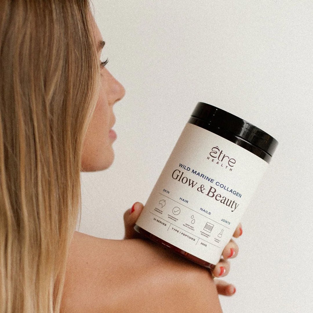
Packaging Design Refresh
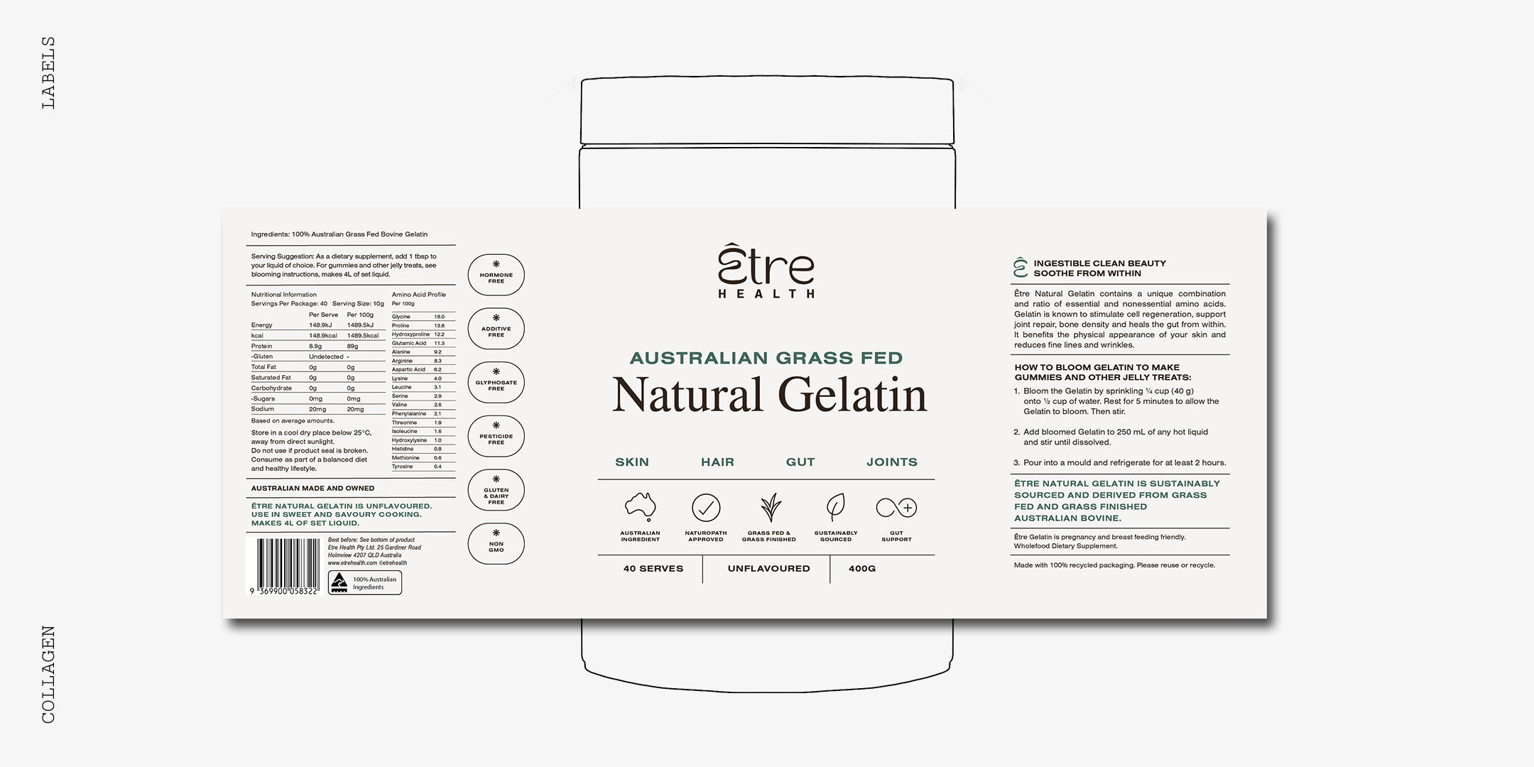
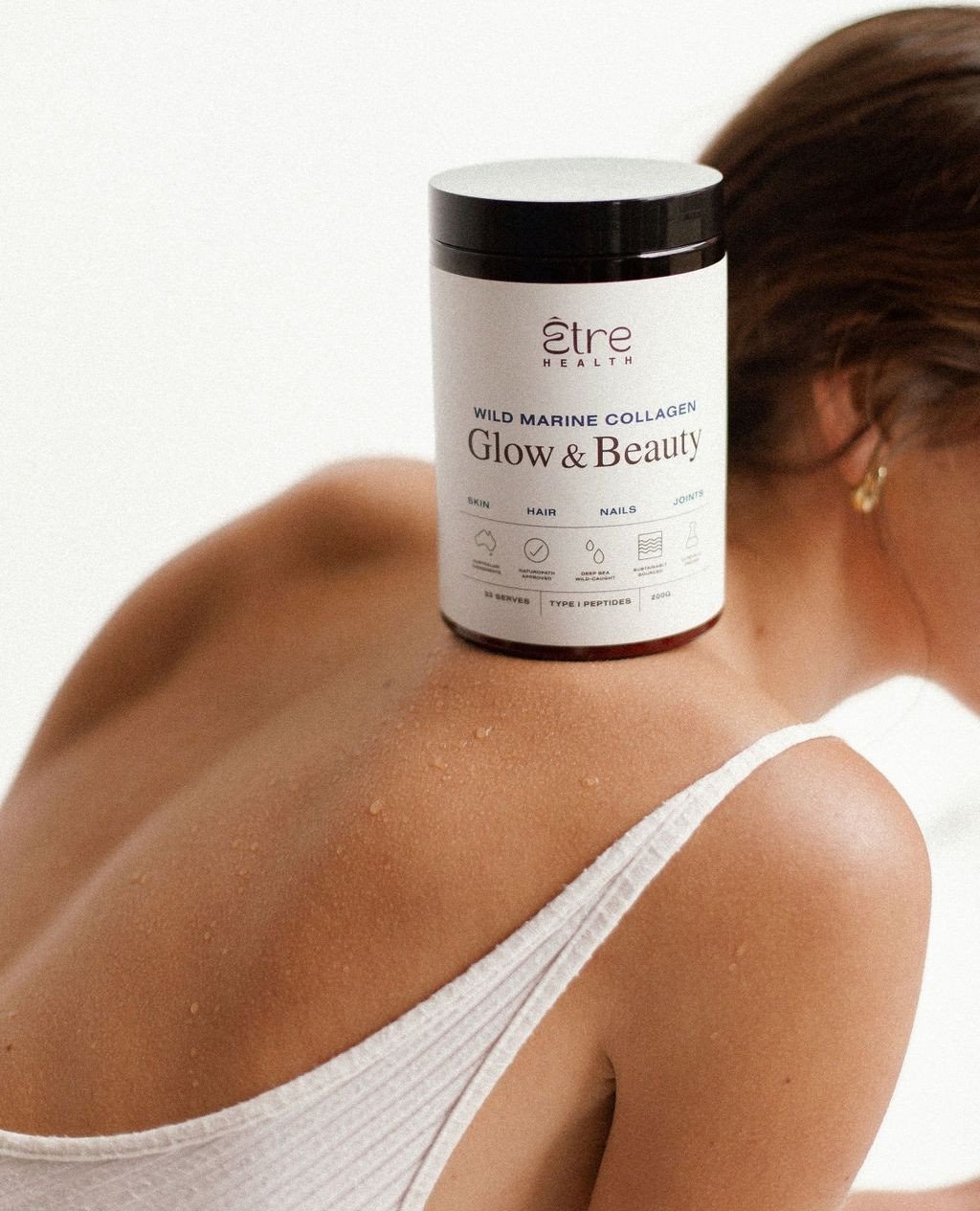
Être
Industry: Wellness / Supplements
Location: Byron Bay, NSW, Australia
Website: etrehealth.com
Être is a modern wellness brand offering health supplements that prioritise purity, transparency, and clinical-grade efficacy. Their brand blends science with simplicity, offering products designed to support energy, immunity, and daily wellbeing.
-
Client goal:
To evolve their packaging into a more elevated, minimal and premium identity that better reflects the quality of their formulations and stands out in a highly saturated wellness space.Previous pain points or problems:
The original packaging was clean but lacked impact. It didn’t fully convey the brand’s clinical positioning or its elevated tone.Business needs:
To gain stronger shelf presence, improve product consistency across SKUs, and create a packaging system that could grow with the brand. -
Design strategy:
A refined, systems-based packaging refresh focusing on elevated simplicity and clinical clarity. This included revisiting typography hierarchy, colour system, materials, and small iconographic cues to differentiate SKUs.Design decisions:
Customised typographic hierarchy with generous whitespace
Neutral, tonal colour palette with subtle product-specific accents
Use of structured grid to support information flow
Soft-touch material and foil stamping for tactile sophistication
Unique approaches:
Packaging was treated like a daily-use object—less ‘supplement label’, more ‘wellness ritual’. Care was taken to create calm, balanced visual rhythm across the front and back of packs. -
What changed after the update?
Être’s updated packaging better reflects their brand maturity and helps customers instantly connect product benefit with brand trust.
Visual transformation:
Modernised the range with packaging that feels as effective as the formulations inside—setting a new standard in the boutique supplement space.

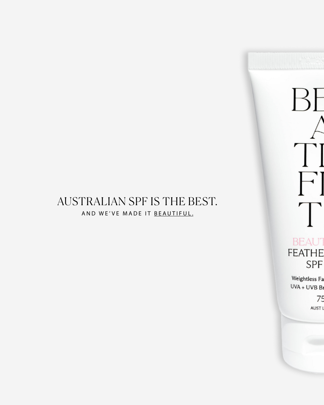
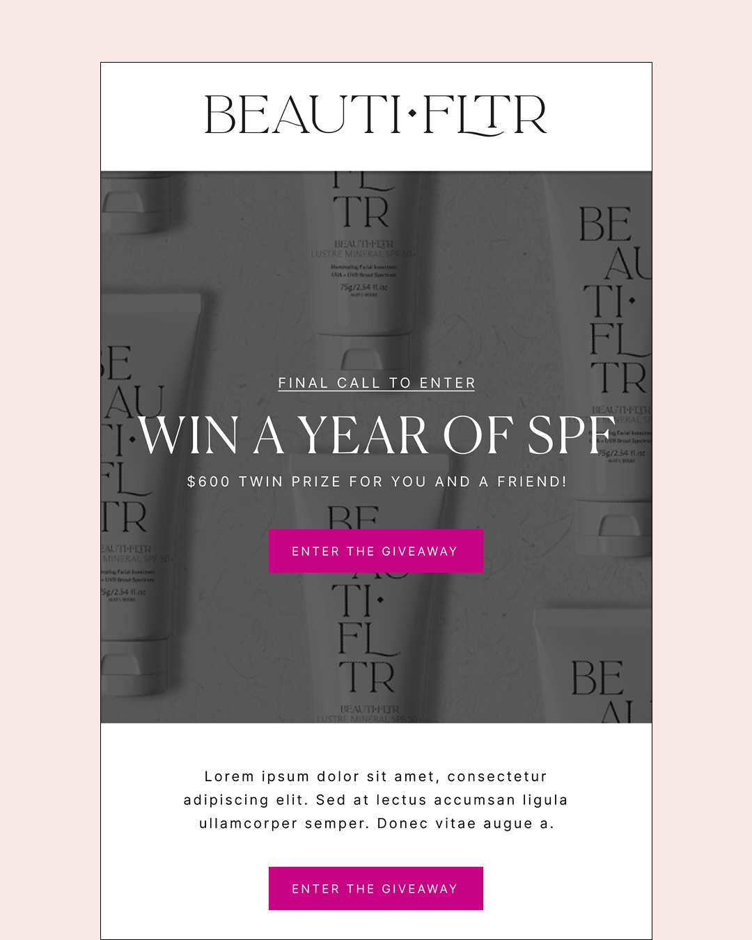
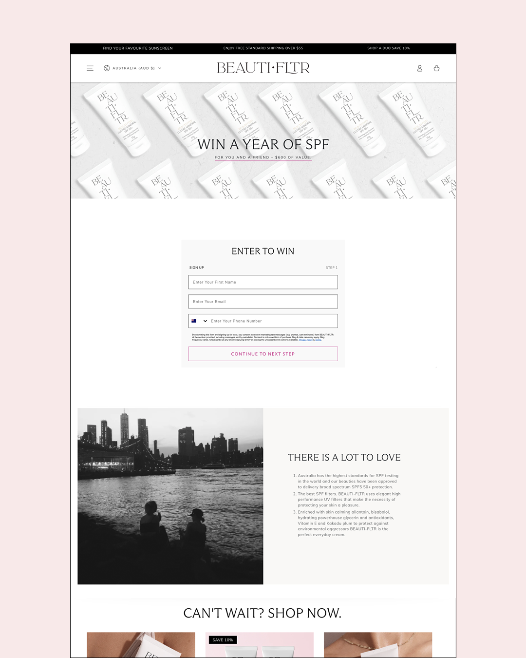
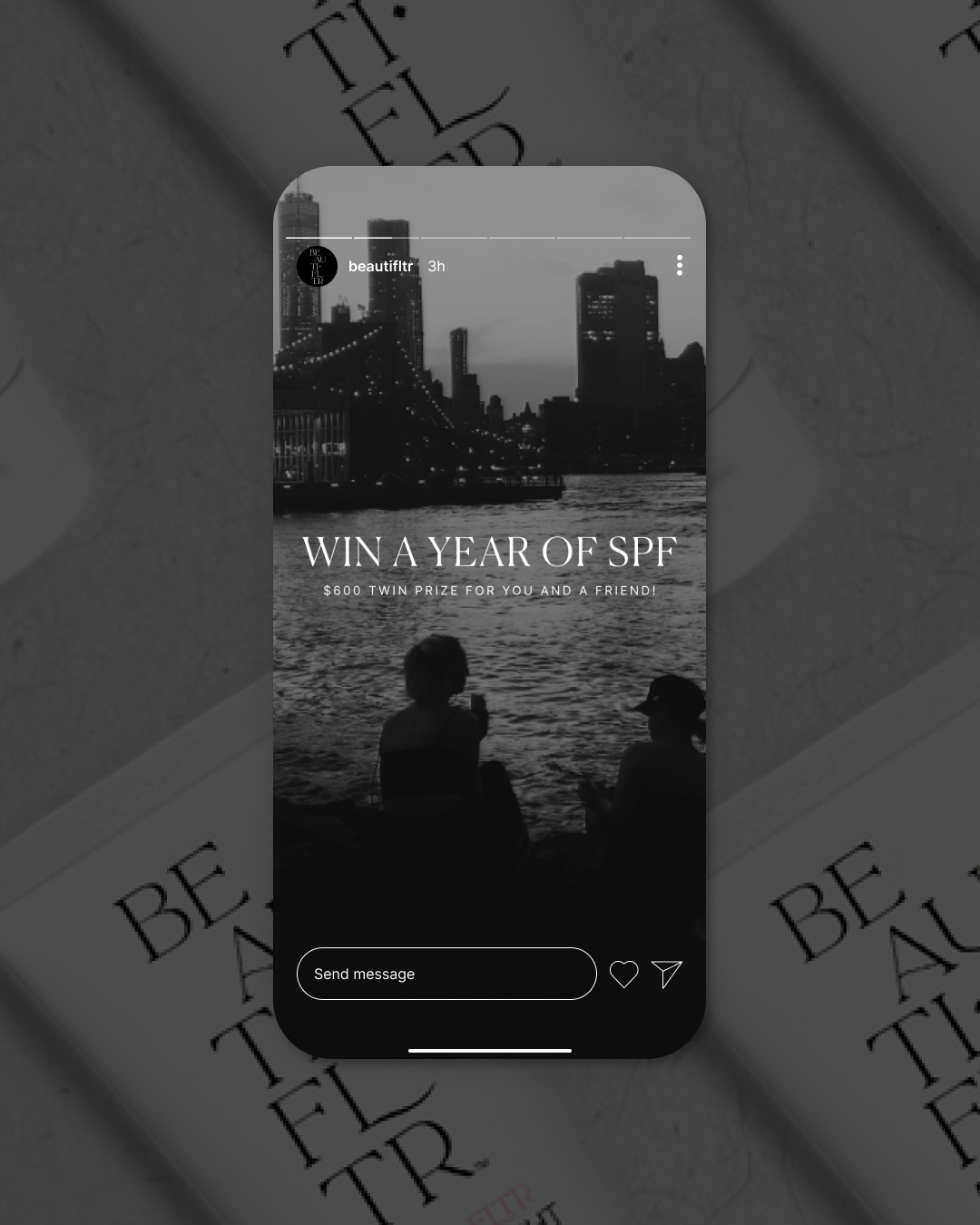
Giveaway Campaign — Landing Page, Social Assets, Email Series
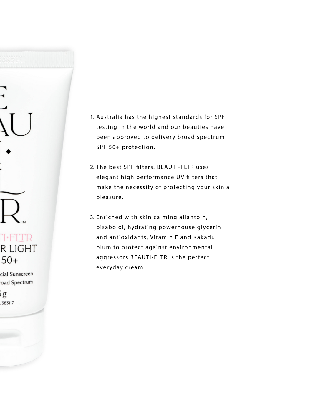
Beauti-fltr
Industry: Skincare / Suncare / Beauty
Location: Northern Rivers, NSW, Australia
Website: beautifltr.com.au
BEAUTI-FLTR is a high-performance sunscreen brand that blends sun protection with a clean, elevated aesthetic. With a focus on minimalist design and modern skincare sensibility, they deliver SPF essentials that feel as good as they look.
-
Client goal:
To grow their audience and visibility through a compelling brand-aligned giveaway campaign that drove engagement and captured high-intent leads.Key objectives:
Launch a limited-time campaign to win a year’s worth of sunscreen
Design campaign visuals that matched their sleek aesthetic
Create an experience that felt elevated, not gimmicky
Business pain points:
As a growing brand, BEAUTI-FLTR needed support aligning their brand presence across digital touchpoints—ensuring consistency and beauty in every interaction. -
Design strategy:
Create a fully branded campaign ecosystem that felt calm, premium, and conversion-ready. Visuals were kept minimal with soft tones and confident typography, mirroring the product’s design DNA.Deliverables included:
Shopify Landing Page: Designed and built a campaign landing page with subtle animation, conversion-optimised layout, and clear CTA.
Social Assets: Static graphics for Instagram (feed + stories) to promote the campaign and drive traffic.
Email Welcome Flow: 3-part Klaviyo sequence to nurture new subscribers, introducing the brand, the giveaway, and product benefits.
Design decisions:
Used black and white city scape imagery with a pop of fuchsia for a chic look
Type-led layouts with breathable whitespace
Clean, refined UI for Shopify to reflect BEAUTI-FLTR’s tone
-
What changed after the campaign launch?
The campaign generated a strong lead list of high-quality subscribers and positioned BEAUTI-FLTR as a premium yet playful skincare brand.Results:
• Growth in email list
• Higher engagement across social
• Campaign served as a brand awareness tool and helped set the tone for future marketing efforts

Email Marketing and Art Direction
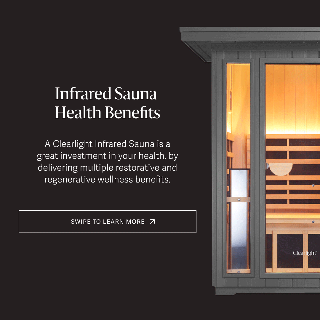
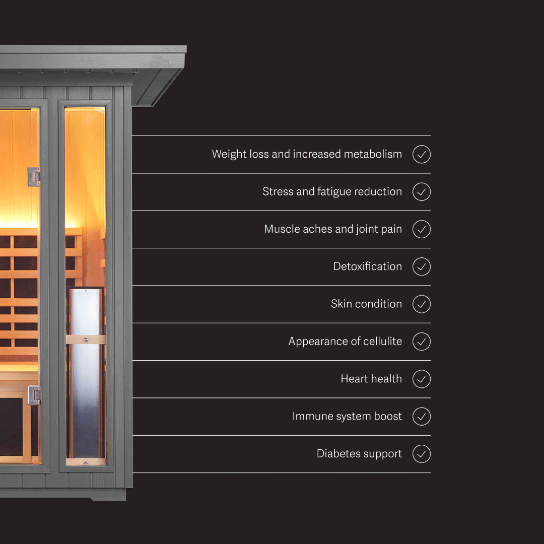
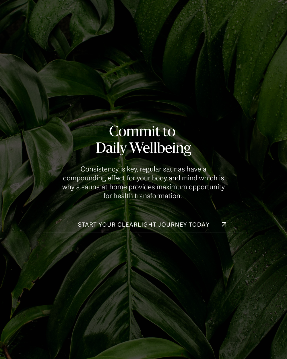
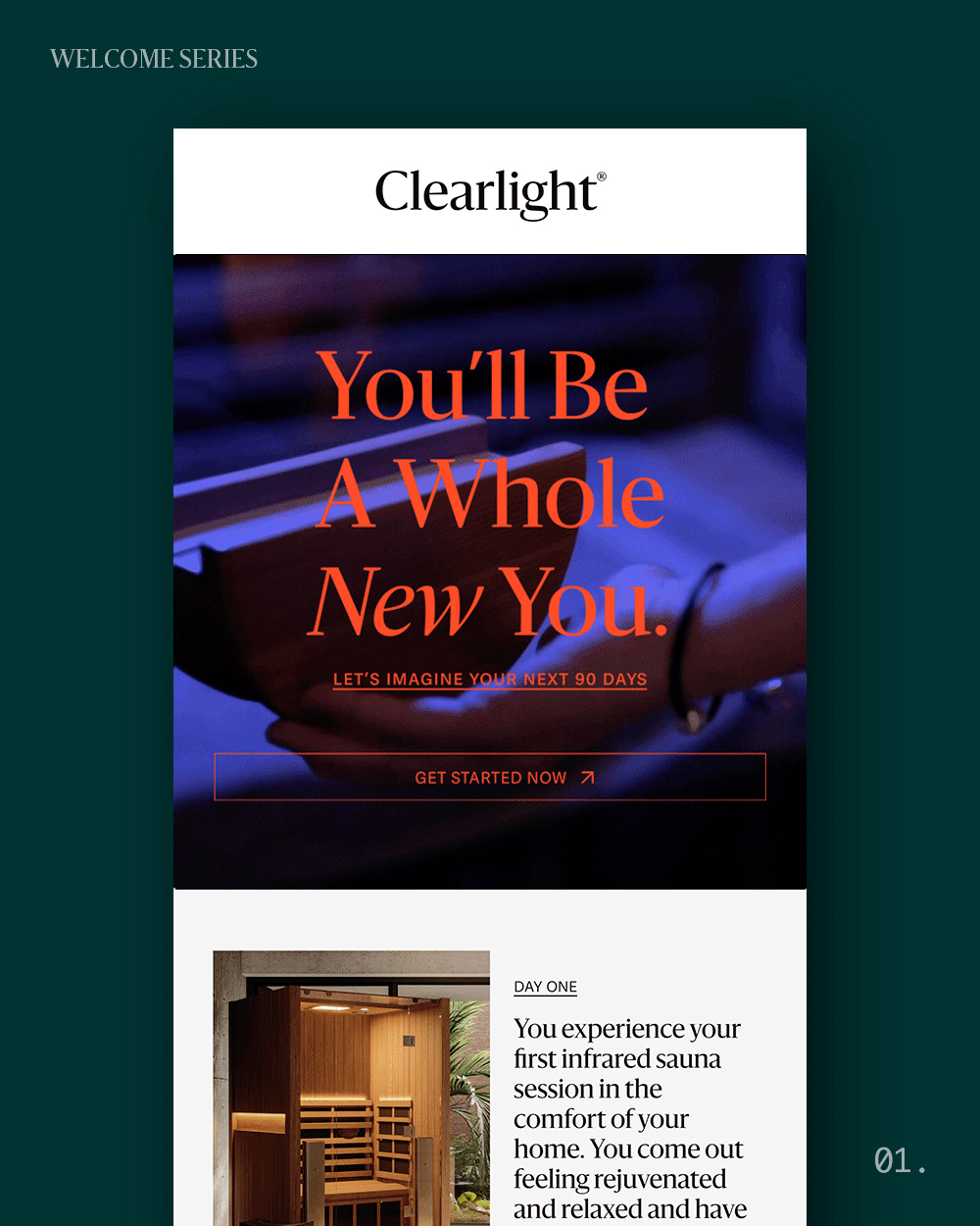
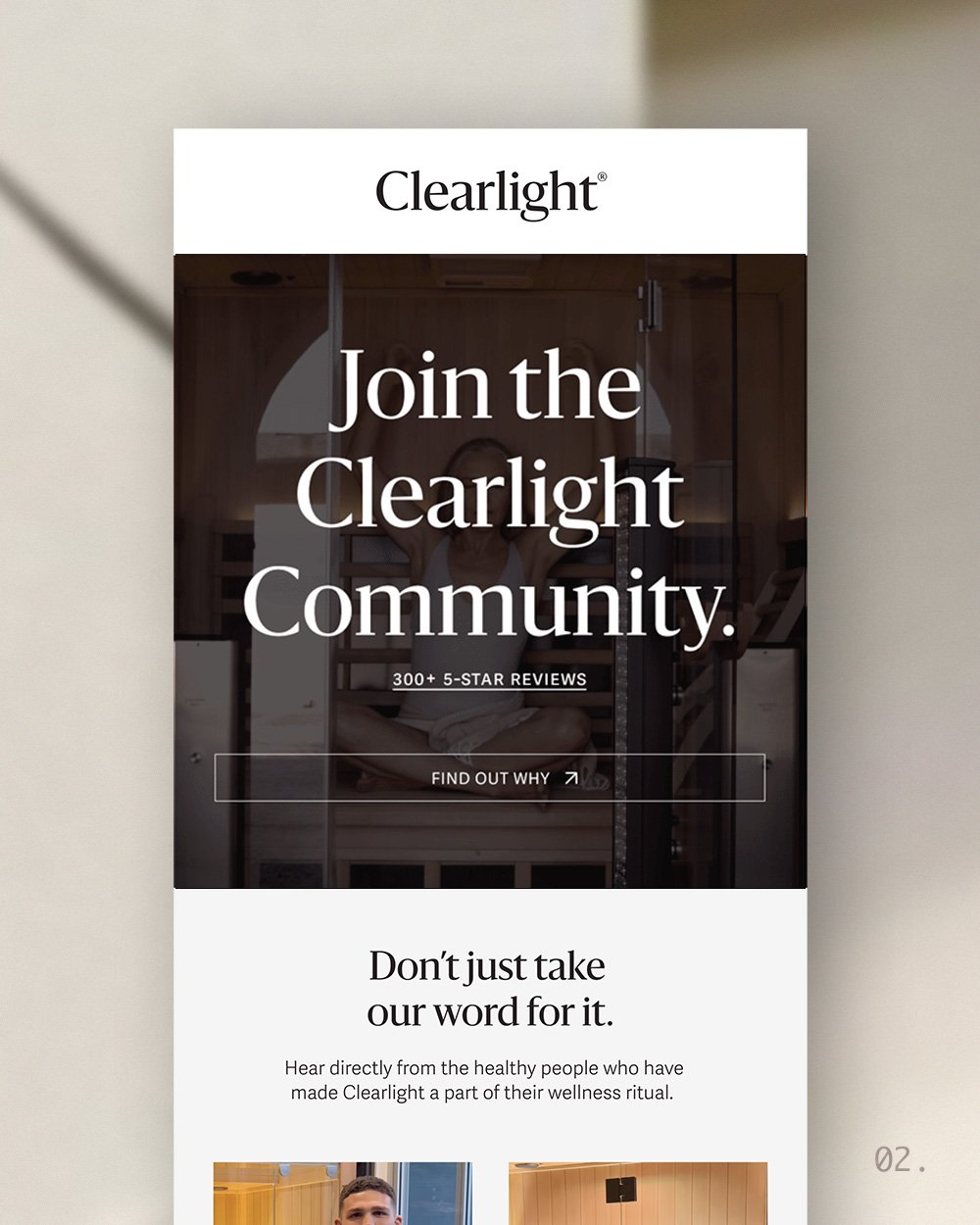
Clearlight
Industry: Wellness
Location: Germany (Global) / Australia (Regional Focus)
Website: infrared-sauna.com.au
Clearlight is a premium infrared sauna brand offering high-tech wellness experiences for home and commercial use. With a focus on holistic health, relaxation, and longevity, Clearlight merges cutting-edge technology with the healing power of infrared.
-
Client goal:
To build a high-performing, brand-aligned welcome series for new subscribers in the Australian market—establishing trust and gently guiding them toward their next step in the journey.Initial challenges:
While the brand had existing materials, they weren’t optimised for Australian leads or structured in a way that built momentum across the user journey. The creative also needed refining to feel more elevated and grounded.Business need:
Develop a refined onboarding experience that captured the brand’s unique positioning and improved lead nurture from day one. -
Strategy:
Design and write a five-part Klaviyo welcome flow supported by fresh art direction—positioning Clearlight as both expert and ally. Every touchpoint needed to feel calming, informed, and conversion-friendly.Scope of work:
Art Direction: Soft textures, soothing neutrals, organic gradients, and luxury-inspired type systems to reinforce clarity and calm.
Email Design: 5 fully built, modular email designs created for flexibility and future repurposing.
Flow Strategy: Emails were arranged to guide a lead through education, social proof, and a clear invitation to act.
-
What changed for the client:
Clearlight’s welcome series now offers a brand-aligned, beautifully designed experience that builds connection and educates users without overwhelming. It laid the foundation for more cohesive lifecycle marketing.Client feedback:
“Lucy took the time to understand who we are and what our audience needs. The new welcome series feels elegant, informed, and completely on-brand—we couldn’t be happier.”Results & Highlights:
Increased engagement and click-throughs
Strong brand consistency across email touchpoints
Modular email blocks used as templates for future campaigns